When it comes to marketing a product, packaging and labeling are essential tools to help convey a product’s message. Packaging and labeling in combination offer the opportunity to create an appealing package that will make the consumer’s experience of the product more enjoyable. Generally speaking, attractive and informative packaging and labeling can benefit companies by helping them to stand out from their competitors and build brand continuity.
The goal of this guide is to provide an overview of how companies can design attractive and informative product packaging by leveraging colour, graphics, typography and content. By understanding these key principles, companies will be able to better communicate with their target audience and improve the overall customer experience.
Overview of Packaging & Labeling as a Marketing Tool
Packaging and labeling are often overlooked as marketing tools, but they can be powerful and effective in helping to increase sales of products. Product packaging and labeling can be used to create a visual impact that captures the attention of customers. It is important for companies to design packaging and labels that are both attractive and informative, as they can influence customers’ purchasing decisions.
Attractive product packaging should draw people to the product by making it stand out from the competition. To achieve this, businesses should include vibrant colors and graphics which effectively communicate the product’s message and purpose. Additionally, labels should provide customers with clear product information that is easy to understand. This can include details such as the ingredients used, the instructions for use, and the product’s health benefits.
Incorporating these elements into product packaging and labels can help companies make the most out of their marketing efforts. This guide will provide an overview of how to design attractive and informative packaging and labels for products.
Definition of Attractive and Informative Packaging & Labels
Attractive packaging and labeling are critical elements of product marketing. Packaging helps to make a product stand out on shelves and drives consumer impulse purchases. It also conveys important information about the product, such as what it is, how it is used, and what ingredients or materials are included.
Informative labels and packaging provide customers with the detailed information they need to make an informed purchase decision. This includes ingredient lists, instructions, warnings, and storage information. This type of labelling gives customers confidence in the product’s quality and safety, and can help to build customer trust and loyalty.
Purpose of this Guide
Packaging and labeling are two incredibly important aspects of marketing that can have a major impact on the success of products on the market. Both design elements have the power to draw consumers in, inform them about a product, and influence their buying decisions. This guide aims to help businesses create attractive and informative packaging and labels in order to better promote their products.
In this guide, we will discuss how to use color and graphics to create appealing packaging, structure labels for better visibility, incorporate product information on labels, and provide tips for layout and typography basics.
By implementing the advice and tips in this guide, businesses will be able to create attractive and informative packaging and labels that will help their products stand out from the competition.
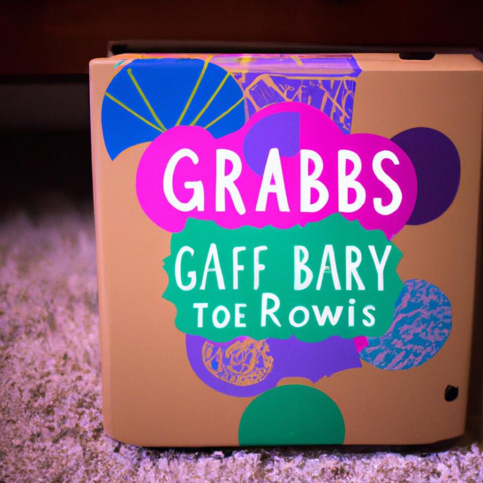
Applying Color and Graphics to Design Attractive Packaging
One of the most powerful tools in product packaging design is color and graphics. Colors can draw attention to your product, help customers identify it on the shelves, and create an emotional connection with potential buyers. Likewise, graphics can be used to communicate the value of a product, captivate viewers, and evoke a sense of trust in the brand.
When selecting colors for your packaging, there are a few core principles to consider. For example, warm colors like orange, yellow, and red tend to evoke feelings of excitement and joy. On the other hand, cool colors like blue, green, and purple can create a feeling of calmness and relaxation. Additionally, you should also think about how colors interact with each other. Sharp contrasts can be visually appealing, while complementary colors can create a softer, more harmonious effect.
Graphics can also be used to make your packaging stand out from the competition. Using unique designs and illustrations can illustrate the purpose or value of the product, while high-quality photography can demonstrate what the product looks like in use. Additionally, you can use icons to quickly convey information about the product.
Fortunately, there are a number of free and low-cost programs available online that allow you to create stunning visuals for your packaging. However, if you don’t have the time or resources to design your own graphics, there are plenty of freelance designers and agencies that can create custom graphics specifically for your product.
The Power of Color and Design in Packaging
When someone sees a product on the store shelf, the first thing they usually notice is the packaging. Color and design are powerful tools used to make products stand out from their competition and draw consumers in. Research has shown that up to 90% of customer decisions about a product can be made based on the packaging – even before they read the label!
The colors chosen for a product’s package can influence feelings and emotions in customers. Different types of products often have their own distinct color associations. For example, blue might be used for relaxation products because it conveys a sense of calm, while red could be used for an energy drink because it indicates excitement and energy.
Design also plays a large role in attracting customers. Simple, yet visually appealing designs often work best. It’s important to keep the overall design consistent with the product’s branding. Products should have a easily recognizable shape or logo that can be remembered by customers. Research has shown that these visual cues help people to remember a brand better and become loyal customers.
Principles of Design for Effective Packaging
Designing attractive and informative product packaging requires an understanding of basic design principles. The elements of design are the building blocks used to create a visually pleasing package – balance, hierarchy, contrast, unity and movement. Balance can be achieved by using symmetry or asymmetry, while hierarchy involves grouping elements in a specific order. Contrast is used to highlight certain areas and make them stand out, whereas unity is created by combining different elements so that they appear as part of the same whole. Movement can be utilized to create a sense of direction and dynamism.
In addition to applying the basics of design, it’s also important to consider the use of color. Color can influence consumer purchase decisions, so it’s important to understand how different colors affect people emotionally. Knowing which colors are best for your product depending on the target audience can help to create a stronger brand identity.
When it comes to packaging design, the colors you choose can have a significant impact on the consumer’s purchase decision. Color carries an emotional charge and can evoke a range of feelings and opinions. Therefore, it is important to select vibrant colors that reflect your product’s quality, value, and aesthetic appeal.
To help you choose the right colors for your packaging and labels, consider the following tips:
- Choose colors that complement each other while also being visually appealing.
- Create contrast by selecting contrasting colors that will help your product stand out.
- Consider using several shades of the same color to give your packaging design a cohesive look.
- Make sure your colors are consistent across all your marketing materials.
- Choose colors that match the identity of your brand and that attract the target audience.
Structuring Labels for Better Visibility
Labels on product packaging are essential in providing customers with valuable information about the product. For labels to be effective, they must not only provide clear and concise information, but also be well-structured and easily visible. Here are some factors to consider when creating labels for packaging.
Fonts
Using the right fonts is important for a label’s visibility. Sans serif fonts are often used for labels as they are generally less decorative than serif fonts and easier to read in small sizes. The size of the font should be large enough to be easily read, without being overwhelming or taking up too much space.
Size and Shape
The size and shape of labels can also have an impact on their visibility. For example, square labels can be helpful in avoiding overcrowding, while larger labels are more likely to be seen and attract attention. Be sure to select a size and shape that works with the packaging.
Arrangement
The way the labels are arranged on the package is also important for visibility. Grouping labels together can reduce clutter and make it easier to read. A grid layout can help keep the labels structured, while allowing each one to be clearly visible.
Labels play an important role in conveying information about a product. As such, it is important to consider certain factors when designing labels for product packaging.
Firstly, consider the size and shape of the label. Labels need to be visible yet not overly large to produce a cluttered effect. They should also be designed to fit the dimensions of the product’s packaging.
Secondly, think carefully about the type of font you use for your labels. Different fonts convey different messages and can impact the overall look of a product. When choosing a font, go for something legible and use bold or larger font sizes to draw attention to important words or phrases.
Thirdly, make sure that any additional images or graphics used on the label are relevant and of a high quality. Such visuals should enhance the overall look and feel of the product and provide useful visual cues to draw consumers’ attention.
Finally, ensure that all necessary product information is included on the label. This includes details such as ingredients, nutritional facts, country of origin, and any legal notices required by law. It is best to keep these elements concise and clear, avoiding too much text or complex wording.
Different Types of Fonts for Labels
One of the most important elements to consider when creating labels is font. It’s important to choose fonts that are easy to read while also adding some personality to your product. There are three main types of fonts that you can use on your labels: serif, sans serif, and script.
Serif Fonts
Serif fonts have small lines at the end of each letter and are a popular choice for labels. They are often seen as traditional, classic fonts and can add a sense of sophistication to your product. Examples of serif fonts include Times New Roman, Georgia, and Baskerville.
Sans-Serif Fonts
Sans-serif fonts have no extra lines at the ends of the letters. This type of font is usually associated with modern and minimalistic designs. Sans-serif fonts tend to look cleaner and more modern and are often the preferred choice for designers because they make text easier to read. Examples of sans-serif fonts are Arial, Helvetica, and Verdana.
Script Fonts
Script fonts are more decorative and evoke traditional handwriting. They can give your labels a more personal touch, but can also be harder to read. Examples of script fonts include Lucida Calligraphy, Bradley Hand, and Giddyup Std.
When selecting fonts for your labels, make sure to consider readability, style, and how well the font works with the overall design. Remember, it’s important for customers to be able to understand the information on your labels, so make sure to choose fonts that are easy to read.
Selecting the Right Size and Shape for Your Labels
When creating labels, it’s important to consider more than just color and design. The size and shape of your labels are also crucial factors to consider when determining how attractive and informative your product packaging will be.
The size and shape of your labels should be chosen carefully to ensure that they fit the intended purpose. It’s best to use a shape that compliments the overall look and feel of the packaging, and that allows plenty of space for relevant information to be seen by potential buyers.
It’s also important to select a size that is both visible enough to make an impact, and not too large so as to be overwhelming. Consider the label’s visibility when placed on shelves alongside other products, and ensure that important information is easy to find.
Finally, using multiple shapes and sizes of labels can help create visual interest and help draw the eye to the most important details. Whether large or small, consider the size and shape of each label carefully for maximum impact.
Layout and Typography Basics for Effective Packaging
When it comes to designing product packaging, layout and typography are two of the most important elements. It is essential to plan the layout in order to make sure that all of the information on the packaging is organized in a way that conveys the most meaning. Similarly, careful selection of a typeface is needed to ensure an easy to read and visually appealing design.
When choosing a layout, it is important to consider the size and shape of the package, how much content will need to be included, and the purpose of the packaging. Balance is key, so consider the shapes and colors you use to create a pleasing arrangement. For example, if the product is a small box, a vertical arrangement can be more appealing than a horizontal one. Typography can also play a role in creating a sense of balance in the overall design.
The selection of typography for product packaging should always be legible and appropriate to the product. Consider the tone of the product, and choose the typeface accordingly. For example, a sophisticated, modern product would require a minimalist font, while an ecological product may require a naturalistic font. Additionally, the size and spacing of the letters should be taken into account – the text should be large enough to be easily read but not too large as to overwhelm the other elements of the design.
When crafting a product packaging design, it is important to keep both layout and typography in mind. When used correctly, these two elements can help to create an attractive and informative design that will appeal to your target audience.
When it comes to the layout of your packaging and labels, there are a few principles you should consider. The most important is creating an organized design that draws the eye to important elements. Make sure that all text is easily legible, that your colors contrast well with each other, and that images are placed in a way that both builds interest and does not overwhelm the viewer. Placing elements closer together gives a sense of unity and creates emphasis on certain messages. It is also important to consider the size of each element in your design and make sure it corresponds with its importance.
Additionally, creating balance in your arrangement helps emphasize the overall design. Balance can be achieved through either radial or symmetrical placement. Radial balance brings attention to the center of the design while symmetrical balance gives a feeling of stability. When done properly, these principles of arrangement help create a cohesive and visually appealing package.
Guidelines for Typography in Packaging
Typography is a critical element of packaging design. It helps to create an attractive design that stands out on retail shelves and can also help to communicate important product information. Here are some basic guidelines to consider when choosing the right font style, size, color, and spacing for your packaging and labels.
- Font Choice: Choose classic and easy-to-read fonts such as Garamond, Times New Roman, and Arial, rather than script or decorative fonts.
- Font Size: Use a larger font size (10-14 points) for the primary text and a smaller one (6-8 points) for secondary information.
- Font Color: Pick colors that contrast with the background and are legible from a distance.
- Line Spacing: Avoid a cramped look by ensuring adequate line spacing between lines of text.
By following these simple tips, you can ensure your packaging and labels are attractive and easy to read.
Incorporating Text and Images in Packaging
When it comes to product packaging design, text and images can be used together to bring the design to life. The right combination of words and visuals can make a product more attractive to customers and make it stand out from its competitors. Here are some tips to help you create effective packaging with both images and text:
- Choose a font that is easy to read and fits the tone of the product. Sans-serif fonts, such as Arial, are often used for packaging as they’re easier to read at small sizes.
- Keep text simple and concise. Cut out extra words and try to get the message across in a few sentences.
- Focus on visual hierarchy. Play with different sizes and placements of text to make it easier to scan and more eye-catching.
- Consider the overall layout of the package. Keep text and images balanced and use enough white space so that the design looks clean and organized.
- Include images that relate to the product. Stylized images of people using the product or illustrations related to the product’s theme can give the packaging a unique look.
By following these tips, you can create effective packaging that uses both text and images to attract customers. Use the right colors, fonts, images, and layout to make sure your packaging stands out and conveys the message you want.
Incorporating Product Information on the Label
Product packaging is not only a great way to attract customers, but it can also be used to provide important information about the product. Incorporating product information on labels is an essential part of creating attractive and informative packaging.
When incorporating product information on labels, there are a few key elements to consider. First, companies should ensure that all necessary information is included. This includes the product name, details about ingredients, net quantity, and any legal notices required by law. For food items, nutrition facts and allergens should also be included.
In addition to including all necessary information, it is also important to make sure that the information is presented clearly and concisely. Complex language or long descriptions can be hard for customers to understand. Where possible, use simple language that is easy to read. Additionally, utilizing tables and outlines can help to make information more organized and easier to comprehend.
Labels are also a great place to provide additional product details or features, such as company values or instructions for use. This type of information allows customers to learn more about the product and can help differentiate your product from competitors.
Finally, when writing product descriptions, it is important to keep in mind the length of the description. Too much information can overcrowd the label and make it difficult to read. Writing concise descriptions is key to creating attractive and informative labels.
When designing labels for your product packaging, it is important to include informative and relevant information. This includes such details as the product’s name, the company’s logo and contact information, list of contents, expiration date, manufacturer information, cautions or warnings and instructions for use.
All of this information provides consumers with a better understanding of the product and helps to ensure safety and quality. Additionally, many legal regulations require certain information to be disclosed on product labels, so companies must take this into consideration when creating their packaging.
For example, food labels must include nutritional information, ingredients lists, allergen warnings, and other details regarding the nutrition of the product. Other products might need to have batch numbers, manufacturing or expiry dates, and country of origin information. The various pieces of information you are required to include will depend on the type of product you are selling.
It is important that all of the information you include on labels is clear and concise, as consumers need to be able to quickly understand the main points. Additionally, all legal notices and warnings should be written in plain language, and easy to read font sizes and colors should be used.
By taking all of these factors into consideration, you can design labels that are both attractive and informative. This will help your product stand out from competitors and ultimately increase sales.
Best Practices for Displaying Legal Notices
When designing your product packaging, one of the most important things to consider is the legal notices that must be included on the label. It is essential to ensure that your company is compliant with the relevant laws and regulations in regards to the information that must be present. These notices should always be kept up to date and accurate.
To display your legal notices in an attractive and informative manner, there are a few best practices that you should follow. The first is to ensure that the font size is easily readable. Smaller font sizes can make it difficult to read the necessary information and may lead to customer confusion. This might result in a company being sued or fined by authorities. Additionally, it’s important to choose a font color that stands out easily from the background color, so that potential customers can identify the legal notices quickly.
It’s also important to think about the placement of the legal notices on the label. Generally, they should be placed in a noticeable location, such as in the top right corner of a package. Additionally, make sure to separate the legal notices from the rest of the information; this allows customers to focus on the important details without getting distracted by the other text or graphics.
Finally, make sure to include all necessary legal notices. Depending on the product, this could include warnings, disclaimers, expiration dates, country of origin, and much more. Always double-check that you have included all the required information before sending your product to market.
Writing product descriptions that are clear and concise can help customers quickly and easily understand the features and benefits of your product. Here are some tips to help you write effective product descriptions:
Stick to the Basics
When creating a product description, make sure to stick to the core facts. Include details about what the product is made of, its size, purpose, etc. You don’t want to confuse readers with too much information, but make sure to include the key points.
Highlight Key Features
Make sure to highlight the features that distinguish your product from others. This will help potential customers know why your product is worth purchasing.
Be Specific
Avoid generalizations and provide detailed numbers and measurements when possible. This sort of information will help give customers a better idea of what they’re getting.
Use Active Language
Write in an active voice so that it sounds more engaging and helps bring your product to life. Make sure the language you use is descriptive and value-driven.
Use Unbiased Language
Avoid using overly biased language as this can be off-putting for customers. Stick with neutral terms such as “may” or “can” instead of “will” or “must”.
Include Benefits
In addition to describing what your product is, explain how potential customers can benefit from it. Think about why someone might want to purchase your product and emphasize those benefits in your product descriptions.
Conclusion
Packaging and labeling play a critical role in presenting products to the world. With thoughtful design, companies have the opportunity to create attractive packaging and labels that communicate information. In this guide, we covered principles of design, color theory, layout and typography, and product information to create attractive and informative packaging.
Practical and creative approaches can be used to make packaging eye-catching while still providing necessary information. Through the use of color and images, bold and stylish fonts, and clear labels, companies can create packaging that captures consumer attention and communicates the value of the product.
While this guide covered the basics of packaging and labeling design, companies should continue to be mindful of potential changes to design trends, materials, and technology as these can all influence product packaging. Additionally, it is always important to consider a customer-first approach when creating product packaging.
In the end, effective product packaging and labeling can be a powerful marketing tool for any business. To make attractive and informative packages that will draw customer attention, it is essential to use colors and graphics carefully, as well as structure labels for better visibility. Layout and typography also play an important role in helping customers understand the product being sold. Finally, it is important to incorporate all necessary product information on the label, while displaying legal notices in a way that adheres to all requirements. With these tips, businesses can ensure their packaging and labeling strategies are successful and attractive.
Final Thoughts About Attractive & Informative Packaging & Labels
When it comes to packaging and labeling, it is important to think of them as marketing tools that can set your product apart from the competition. Using attractive colors, graphics, font, layout, and typography can create a more professional and memorable look. Additionally, information like product descriptions and legal notices must be clearly displayed on labels in order to inform customers. Creating effective packaging and labels takes careful consideration and thoughtful design.
In order for your product to stand out on store shelves, it is important to invest time and resources into designing attractive and informative packaging and labelling. By following the recommendations and best practices outlined in this guide, you have all the tools you need to develop engaging and eye-catching labels and packaging materials.
Companies that are looking to learn more about effective product packaging have a variety of options available to them. Keeping up with the latest trends in design and best practices for creating attractive, informative labels and packaging is key to staying ahead of the competition.
To ensure that products stand out on shelves and attract customer attention, companies need to investigate potential design solutions and stay updated on industry-wide advances in printing, production and labeling technologies.
Some ways companies can stay informed include:
- Reading online blogs or magazines related to design and packaging.
- Attending trade shows and conferences dedicated to product packaging.
- Following popular social media accounts that demonstrate new and trendy packaging designs.
- Drawing inspiration from successful package designs in the marketplace.
Through active research and exploration, companies can uncover fresh ideas and create compelling visuals that will make their products stand out from the crowd. Taking the time to find new ways to appeal to potential customers is an essential part of successful product marketing.
comments: 0
